
Activate study country view
— Project scope
End-to-end UI UX
Re-skin/Overhaul
— Role
Research
Wireframes
Prototypes
UI/UX
Branding
— Duration
3 months
The problem:
Overtime Activate rapidly growing features have added complexity to the workflow experience making it challenging for users to complete work. Activate needs to improve their core feature user experience to attract and retain clients.
Goals:
- • Improve current end-user satisfaction with Activate customers
- (large CROs performing work on large number of studies)
• Surface valuable content & improve workflow
• Update UI for scale
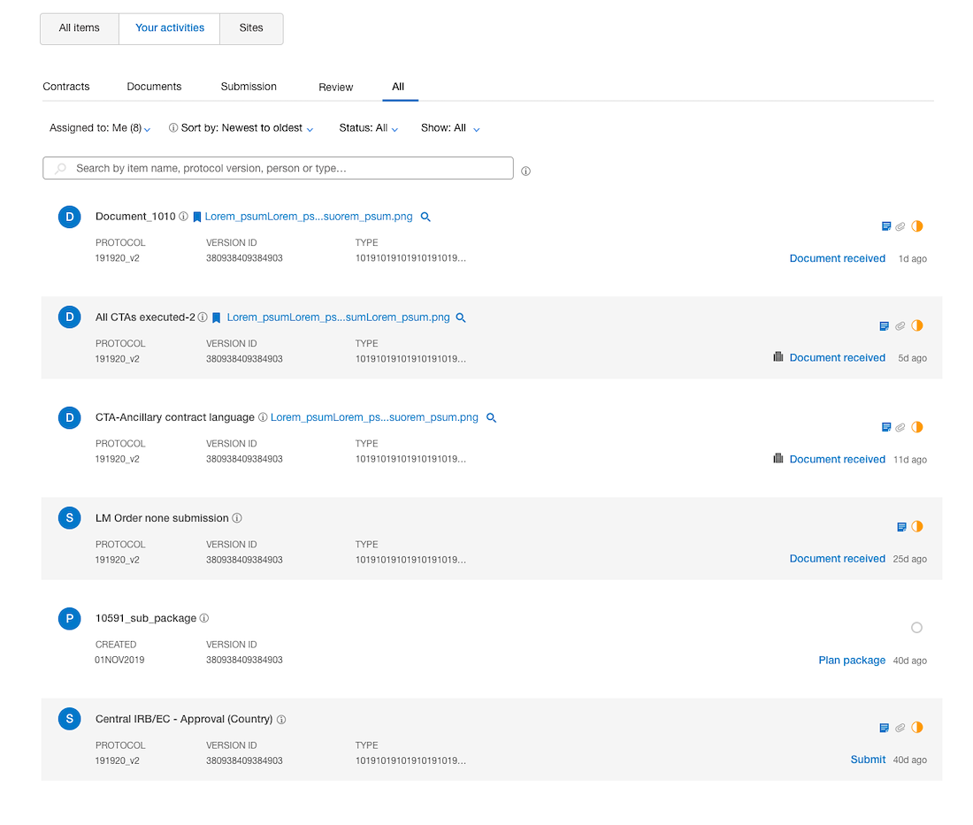
LEGACY VIEW
Activities Due
LEGACY VIEW
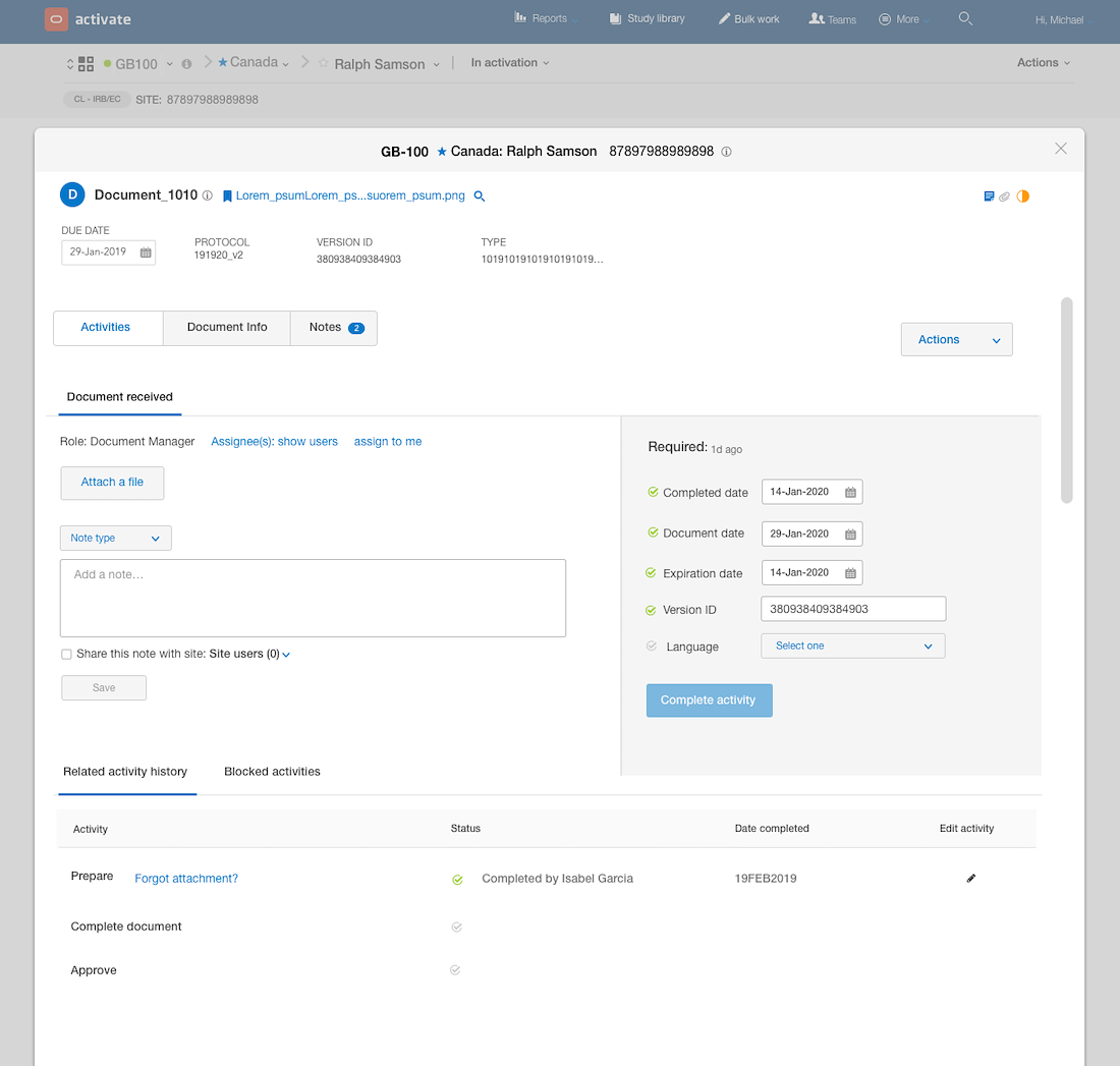
Activity expanded
LEGACY VIEW
Country Sites
Legacy view
Country/Site notes


Research
Goals:
- • Understand Study Start up process and roles
- • Identity personas and their goals while using the Activate product
- • Uncover people’s experience with the Activate product
- • Identify what features are of highest value to users
- • Learn about the pain points users may have
Approach:
First we defined business and user experience goals as a team. We reviewed existing feedback from our users and identified trends. The main trends were accessibility/navigation, intuitiveness, performance and personalization. The research strategy and new prototype concepts were focused on these trends.
Group User feedback sessions 40+ 1:1 sessions . Met virtually and in person with various types of users. During the sessions shadowed users as they performed every day tasks related to their roles. The users also provided feedback on the new prototype concepts. After gaining enough insight from the qualitative and quantitative data we validated the direction for a phase one of implementation.


User Persona (Power User)
Findings
Legacy views
- 1. Alerts: The use of space for alerts takes away from the actual space being used for the activities
- 2. Single activity: Users have to open item activities to read metadata that ideally could be surfaced
“Reorganize content to better focus on work that is due and be able to closely look at the info without having to open up all the sections” -SSU Lead (PPD)

- 3. Open activity: Navigating to an activity – Clicking on alerts opens up activities and can be visually challenging to process.
- 4. Completing work: Working on an activity from the accordion is challenging. The way the activity opens make it hard to focus and digest content. It is unclear to a user what fields are required to complete an activity.
“Layout and interacting with activity widgets are confusing and challenging to work in.. “
-Site Coordinator (Pfizer)

- 5. Activity layout: The activity is in an artifact that contains valuable data. The way the data is organized requires too many clicks to view and requires a lot of scrolling.
- 6. Disclosures: There are multiple disclosures that do not scale well and have been slowly added over time. Users want to easily view attached files and track fields that need to be completed.
“I’m spending too much time clicking around to find the data I need.." - Contract Specialist (PPD)

Key Findings

Design Proposals

Proposal 1: Accordion concept
Pros:
- • Easy implementation
- Users are already familiar with the accordion interaction
- • When alerts are collapsed user has more space
Cons:
- • When alerts are expanded the use of space is not ideal for completing work
- • Accordion view is not ideal because user loses context
- • Too much scrolling
- • Doesn’t scale well

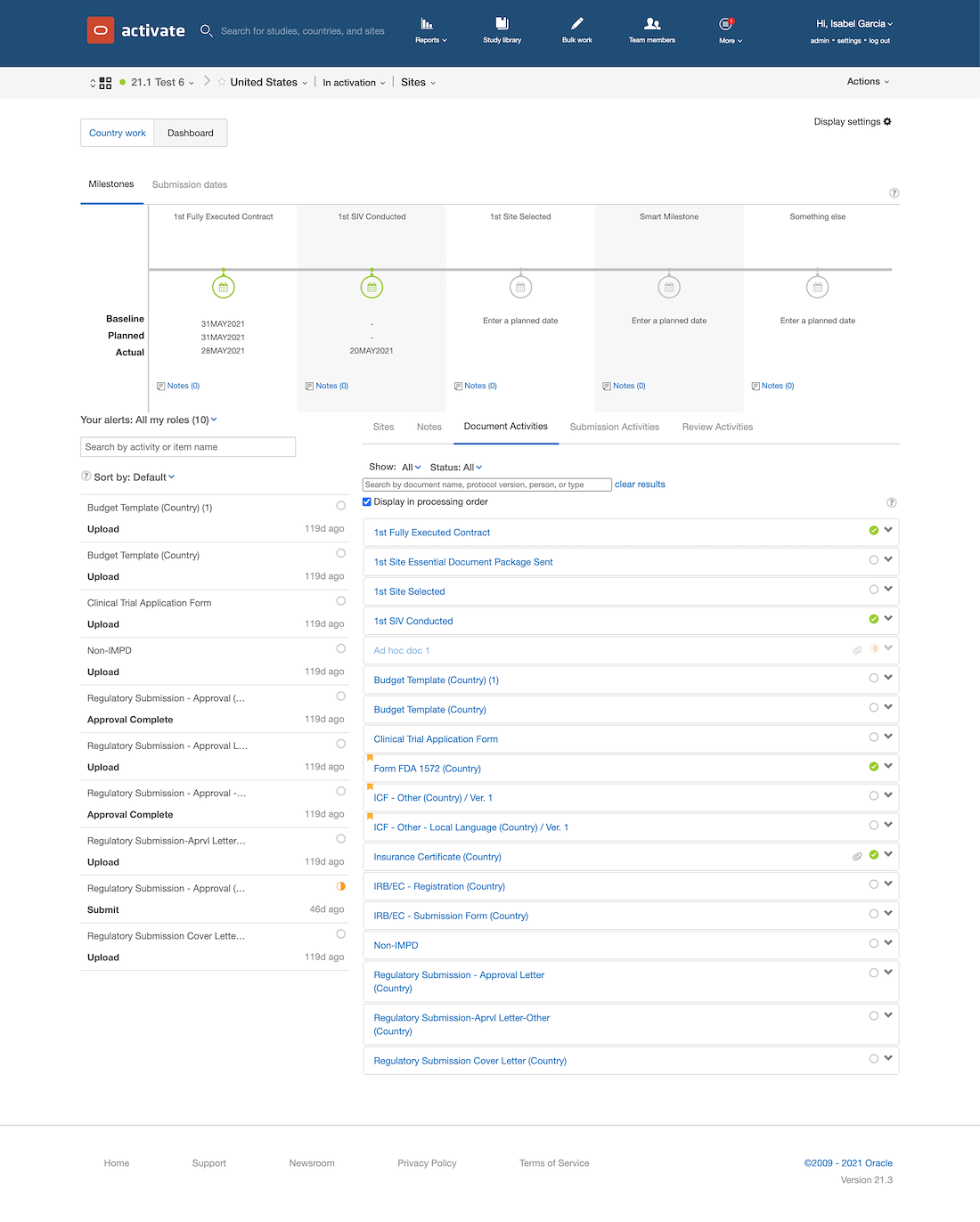
Proposal 2: Single page concept
Pros:
- • Use of space – Highlights valuable content
- • Improved layout organizes fields that are required
- • Easier to identify bottlenecks
- • Enhanced filters make it easier to navigate and find work to complete
- • Improved user experience can reduce learning curve
- • Scales well as new features/fields continue to be introduced
Cons:
- • Version adoption and configuration updates
- • Will require updates to training material
- • Development time
- • Cannot easily be implemented as a reusable component
- • Context is not visible

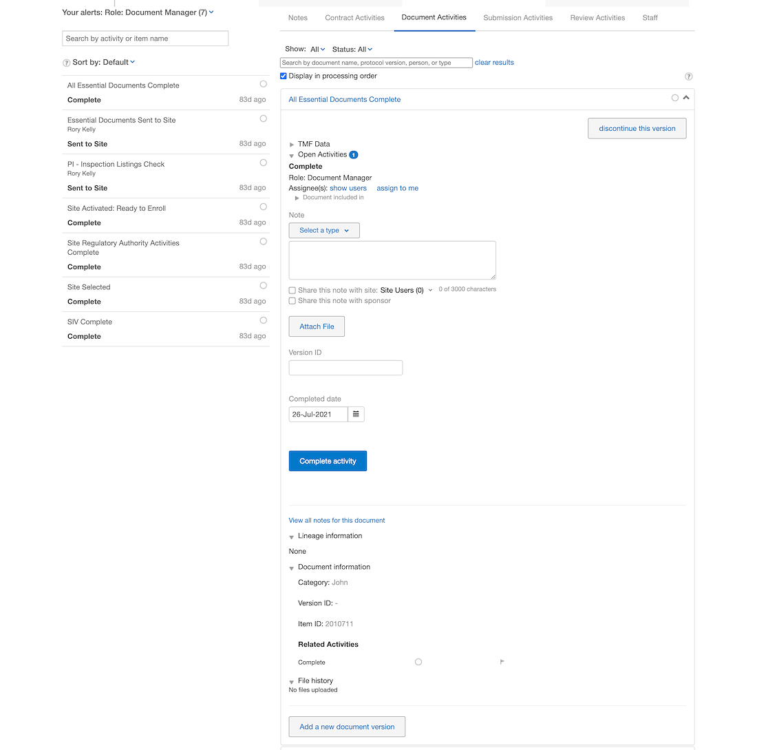
Proposal 3: Modal concept
Pros:
- • Use of space – Highlights valuable content
- • Improved layout organizes fields that are required
- • Easier to identify bottlenecks
- • Enhanced filters make it easier to navigate and find work to complete
- • Improved user experience can reduce learning curve
- • Scales well as new features/fields continue to be introduced
- • Modal component is easily re-usable and will scale well
Cons:
- • Version adoption and configuration updates
- • Will require updates to training material
- • Development time
- • Cannot easily be implemented as a reusable component

Winning Concept
Winning Concept
The outcome
- • The design was re-imagined with the idea that is a heavily configurable software but can also be
- an out of box solution for new customers that do not have training resources and have fewer
- studies to manage
- • Features continue to be added, therefore the layout lends for adding more data and introducing new lifecycles
- • The layout is now set up to support reports and notes with more real estate